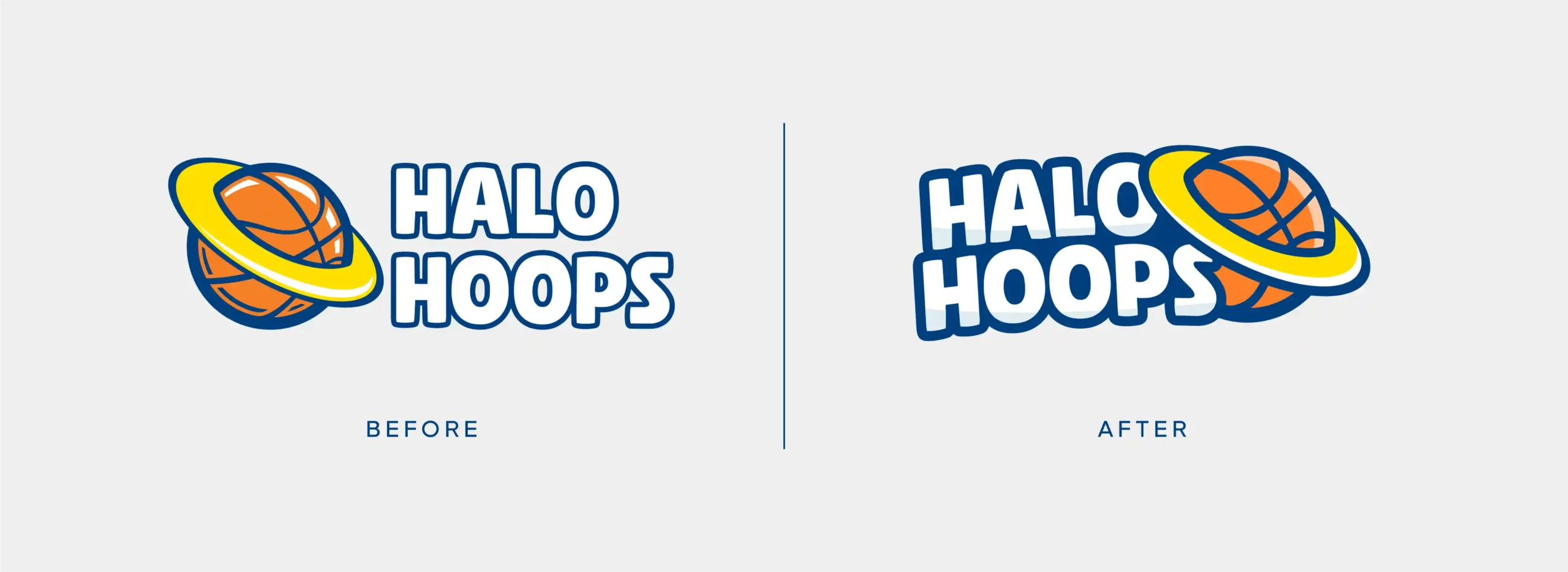
Halo Hoops has been operating for over 25 years, impacting the community in a positive way and building valuable brand-equity along the way. Keeping the aspects that locals had grown familiar with was crucial in updating this identity.
The brand mark already had a clean look and a strong concept, but struggled with scalability and execution. By adjusting the weight of the outlines, simplifying the shapes, and updating the colors, the mark became a charming and relevant icon that could be used at any size. These refinements also made the logo significantly easier to reproduce across physical applications and varied printing methods.